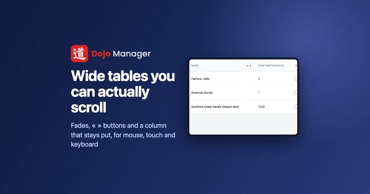
Dojo Manager, the app I’m building to run our karate school, is full of wide tables: who’s ready to grade, reports with a dozen columns, every dojo on the platform. On a Mac you swipe sideways on the touchpad and the rest appears. On a Windows computer with a mouse there’s no obvious way to see the hidden columns, and often no sign there are any. This is how we made those tables show what’s off to the side, and get you there, whether you use a mouse, a touchpad, a phone or a keyboard.
Columns nobody knew were there
The question came from a screenshot of the grading screen. The table looked complete: a name, a style, a rank, when they last graded, how many classes since. But the two columns that matter most, the next rank and whether they’re ready, were off to the right. With a touchpad that’s a swipe. With a mouse, the scroll bar that would reveal them sits under the last row of the table, which on a long list can be a long way below the bottom of the screen. Even the row of tabs above it was cut off at “Styles & R”, with nothing to say there was more.
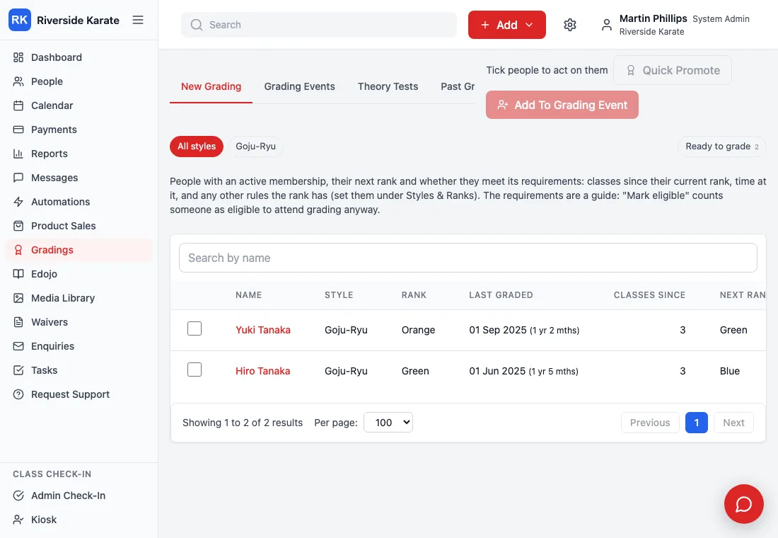

At a normal laptop width, the dojos table held 1,617 pixels of columns in 842 pixels of space. Nearly half of it was invisible.
One fix for every way of getting around
My first idea was a pair of buttons in the table’s top corners, « and », to scroll it. That helps a mouse, but each way of moving around needs its own clue. So we ended up with a small set that work together:
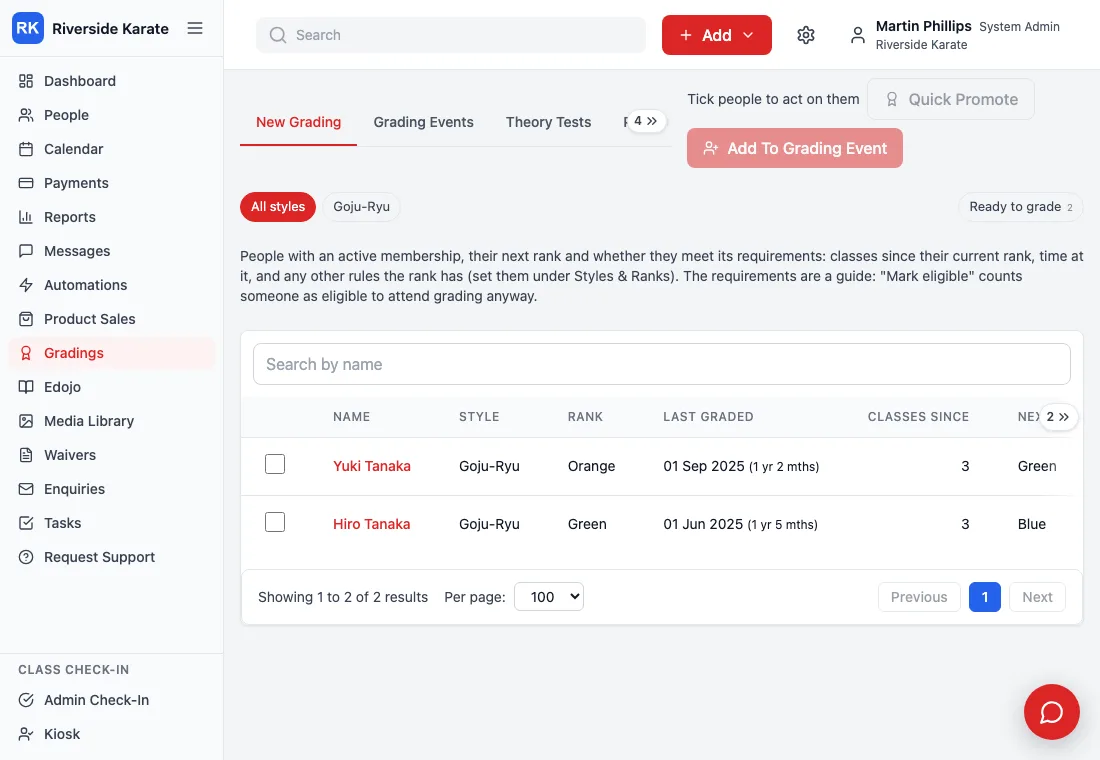
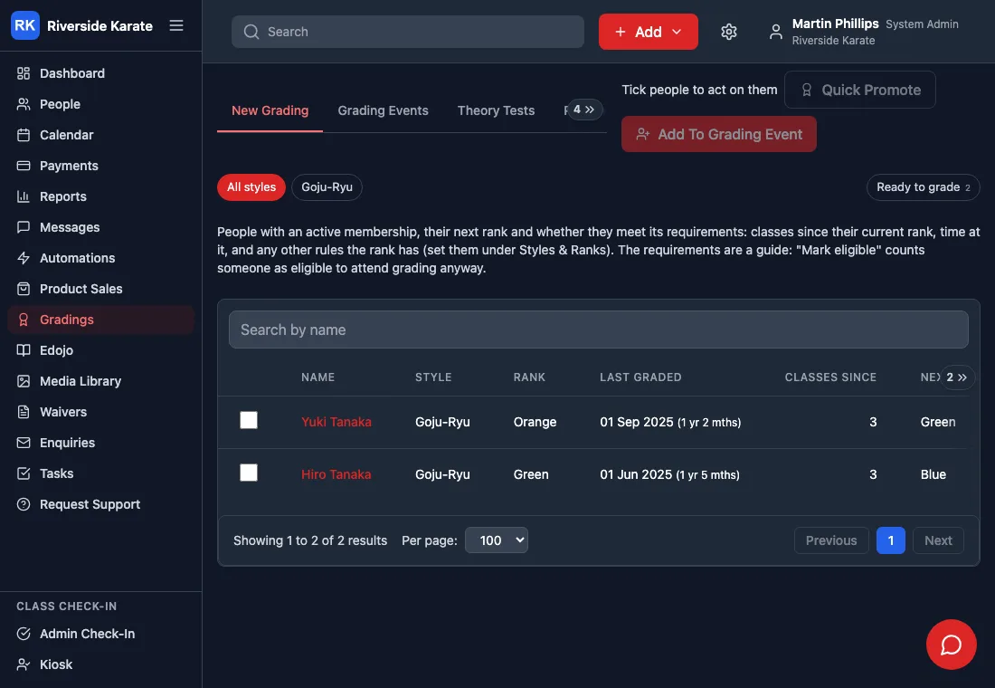
- A fade on the side with more. The edge of the table softens where it carries on, and the fade disappears when you reach the end.
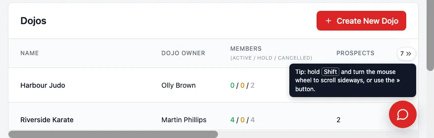
- « and » buttons with a count. “7 »” means seven columns are out of sight. A click brings the next whole column into view, not just an arbitrary distance.
- The name stays put. When you scroll sideways, the name column (and the tick box beside it) stays where it is, so you never lose track of whose row you’re reading.
- Arrow keys. Tab to the table and the left and right arrows scroll it, with a visible outline so you know it’s selected.
- A scroll bar where your mouse can reach it. If the table’s own scroll bar is below the bottom of the window, a copy sits along the bottom of the screen while the table is in view.
- A tip, once. The first time a mouse goes over a wide table, a note says that holding Shift and turning the wheel scrolls sideways. Most people never knew.

Two ideas didn’t make it. Dragging the table with the mouse fights with selecting text and clicking links. Turning the normal scroll wheel sideways breaks scrolling down the page, which is what the wheel is for.
Making it work everywhere at once
There are more than 50 places in Dojo Manager that hold a scrolling table, plus every row of tabs. Fixing them one at a time would have taken days and missed some. Instead, one small script finds anything that scrolls sideways when the page loads, or when a table arrives later in a pop-up or a tab, and adds all of the above only when the table is actually too wide. A table that fits looks exactly as it did.
The buttons and fades live in a thin strip that rides along inside the table as it scrolls, so nothing around the table moved. That mattered more than anything: a change to every table in the app is only safe if it can’t shuffle the rest of the page.
The traps
Two bugs cost real time. The first: once the name column was pinned in place, the browser reported its position as wherever it had been carried to, not where it started. So after one scroll the « button landed in the middle of the table and claimed four hidden columns instead of two. The fix was to measure from where we’d put it ourselves.
The second: the scroll bar along the bottom of the screen and the table had to follow each other. My first version had each one tell the other when it moved, and they argued. Drag the bottom bar and the table snapped it straight back. Now each one only copies the other when they differ, and they settle.
Testing the Windows case on a Mac was its own small puzzle. The screenshot tool on a Mac never shows old-style scroll bars, so for the tests I forced them on with a style sheet, which is how the shot below was taken.
Checking every page
The second half of the job was finding everywhere else this could bite. Rather than trust my memory of 78 tables, a script visited every page in the app: 107 staff and platform pages, the members’ app, every tab of a person’s profile, and a copy of our own dojo’s gradings, payments and waivers with its real volume of data, each at laptop width and at phone size. On each one it looked for anything spilling sideways without the new help.
It found two genuine bugs that had nothing to do with tables being wide, and that nobody had reported. A person’s attendance list was 41 pixels too wide, so the whole page wobbled sideways. And on the classes report, a drop-down list as wide as its longest choice pushed the page 100 pixels past the edge of the screen. Both are fixed, and six smaller tables that could be too wide on a phone now scroll properly too.

What’s next
This reaches our dojo with the next update. It’s the kind of change nobody notices when it works, which is the point: the hidden columns were always there, and now everyone can find them. The earlier posts on gradings and who can do what at your dojo show more of the app these tables live in. If you run a dojo and would like to hear when Dojo Manager is ready, get in touch.