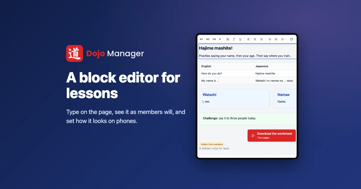
Lessons in Dojo Manager’s Edojo, the online training area of the app I’m building to run our karate school, now have a block editor like WordPress’s. You click into a lesson and type on it, and what you see is what members will see: the same colours, the same layout, the same page. Changes wait in a draft until you press Update, and every block can be set to look different on a phone, a tablet or a computer. This is how it went from a list of one-line summaries to that, over one long day.
Editing a lesson you couldn’t see
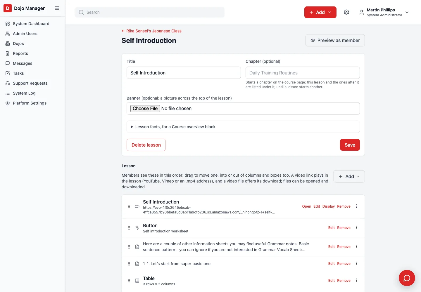
The day before, lessons had become a lot richer: text, pictures, tables, columns, coloured boxes and buttons, all built from blocks. Our Japanese course came across from our old website that way. But staff still edited a lesson as a list, one line per block, and each block opened its own pop-up form. To see what members would actually get, you pressed Preview and hoped.
A lesson of nearly twenty blocks was a list of nearly twenty lines like “Table, 3 rows × 3 columns”. I asked for what I’d want myself: an editor like WordPress’s, where the page you’re editing is the page.
Drafts before anything else
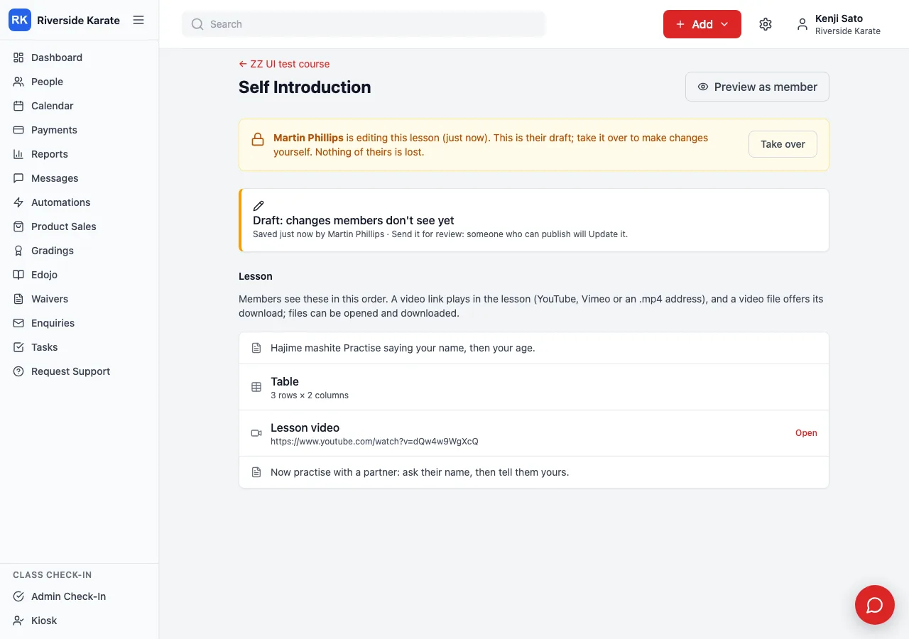
Before building the editor itself, I wanted the safety net. If what you type goes straight onto the page, members would see every half-finished sentence. So a lesson you edit is now a draft: members keep seeing the lesson as it was until you press Update. Discard throws the draft away, and Undo and Redo go back up to 50 changes, even after you close the page.
Update keeps the version members saw before it, the last 10 of them, and any can be put back. Two other things came out of thinking about real staff rather than one person at a keyboard. If someone else has been editing a lesson in the last 15 minutes, you’re told who, and you can take it over without losing their work. And staff who may edit but not publish get Send for review instead of Update, which gives everyone who can publish a task to check it.
The part I was most careful with was members’ progress. When a draft is published it is written back over the same lesson, so the days members have ticked and the links that point to a lesson never change. 46 checks on a throwaway course had to pass before I moved on.
The page is the lesson
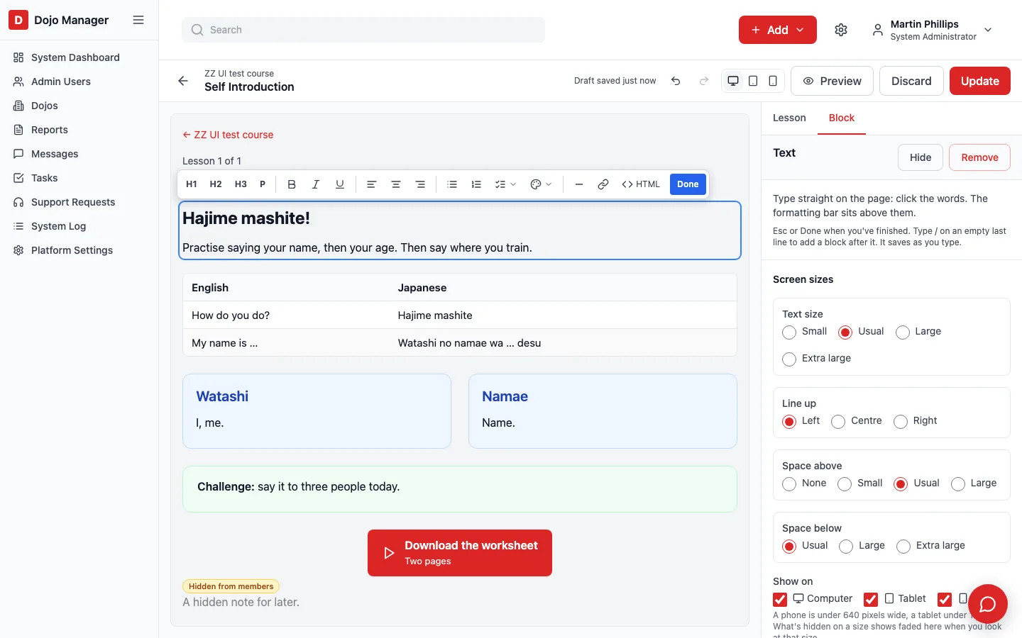
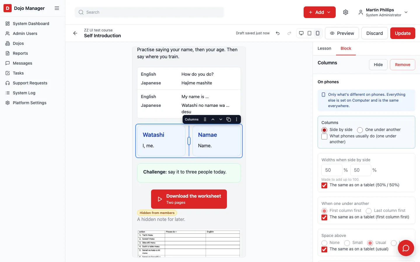
The editor shows the lesson exactly as a member’s page draws it, with the dojo’s theme, its columns and boxes, and dark mode. Click a block and its settings appear in a panel beside it. A small toolbar above it moves it, copies it, hides it from members or saves it to a library for use in other lessons. The settings are the same forms the pop-ups used, so every option was there from the first day rather than rebuilt one by one.
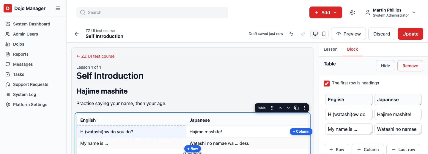
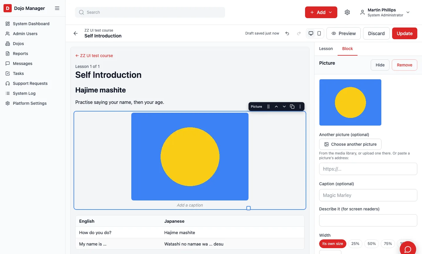
Then the typing. Click any words and type: the formatting bar floats above them, and the lesson saves a moment after you stop, without the page jumping. Type “/” on an empty line to add the next block, as in WordPress. Table cells, captions and the words on a button can be typed in place too, and a selected table gets + Row and + Column on its edges. Drag a picture from your computer onto the lesson, or paste a screenshot, and it becomes a picture block where you dropped it.
One small decision came from looking at it in use. The text editor still had an Image button, but a picture in a lesson is now its own block with its own width, caption and link. Two ways to do the same thing is one too many, so lessons lost the button. Messages and notes keep it.
One place for pictures and files
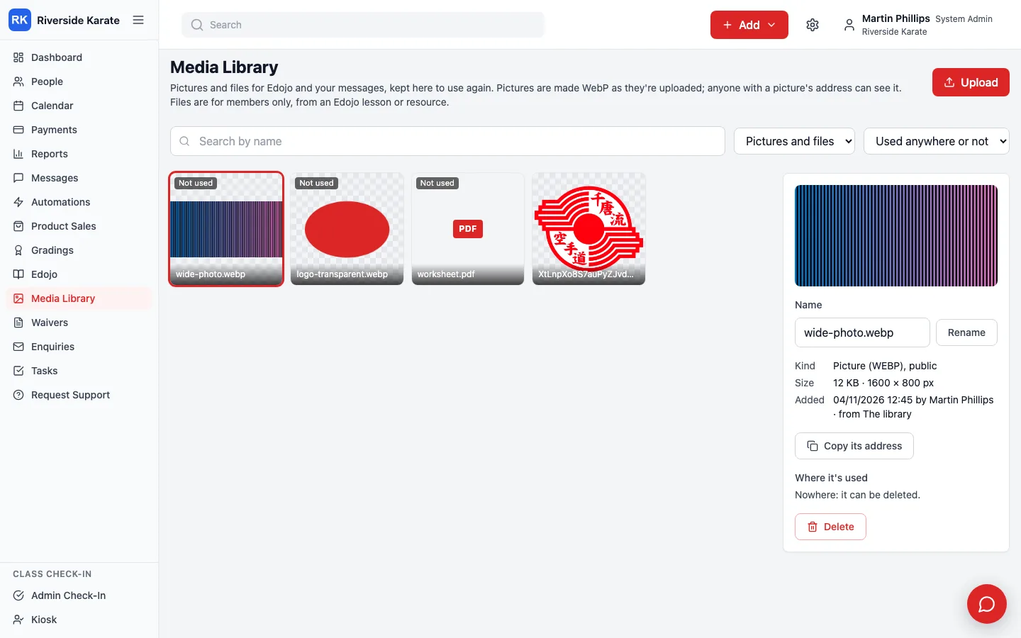
Every picture you drop in has to live somewhere. Until now Dojo Manager had three separate collections: one for messages, one for notes, and one Edojo made up as it went. They’re now one media library for each dojo, sorted for you by kind and by where each item is used, so there are no folders to keep tidy.
Pictures are saved in WebP, a newer image format that is far smaller: a 450 KB photo became 12 KB. The catch is that Outlook on Windows can’t show WebP, so each picture keeps an ordinary copy beside it and emails use that. Nothing can be deleted while a lesson or a draft uses it, and a picture that has gone out in an email stays for good, so an old email never shows a broken image.
Phones, tablets and computers
Once the editor worked, I had one more idea. Most of our members open lessons on a phone, and a layout that looks right on a computer doesn’t always work at 390 pixels wide. A picture that should take a quarter of the page on a computer might need the full width on a phone. So every block now has settings for three screen sizes.
You set a block up on Computer as usual, then switch the editor to Tablet or Phone. The lesson shrinks to that size, and the panel shows only what can be different there, each with a tick box for “the same as on a tablet”. A picture’s width and place, columns side by side or one under another (and which comes first), how many pictures across, a button full width, text size in four steps, the room inside a box, the space above and below: each can differ. A block can also be hidden on a size, and it then shows faded in the editor at that size, so it’s never lost.
Phones already had some habits of their own: columns stack, picture grids drop to two across, and a table’s rows become small cards. Those stay the default, and the panel says so (“What phones usually do”), so it’s clear why a phone isn’t simply copying the tablet.
The trap that cost time: the editor’s “computer” view is narrower than a real computer’s screen, because the settings panel takes space. Going by width alone, the editor would have drawn every lesson as a tablet. So the editor tells the lesson which size it’s showing, while members’ own pages still go by the width of their screen.
Lighter on a phone
Three last pieces were about phones on mobile data. Pictures wider than 1200 pixels get a 1000-pixel copy that phones are given instead. I only make a copy above that size, because shrinking a picture that is already small saves nothing. When I ran it over Sunshine Coast Karate’s 71 pictures, none needed one: they were all small enough already. So it’s there for the big photos still to come.
A video hidden on phones is no longer downloaded on phones. That needed more than hiding it, because Chrome still loads a hidden YouTube video in the background, so the video now waits until it is actually on screen. And a table set to scroll sideways on a phone first did nothing, because browsers ignore a minimum width on tables. It’s now given one from its number of columns.
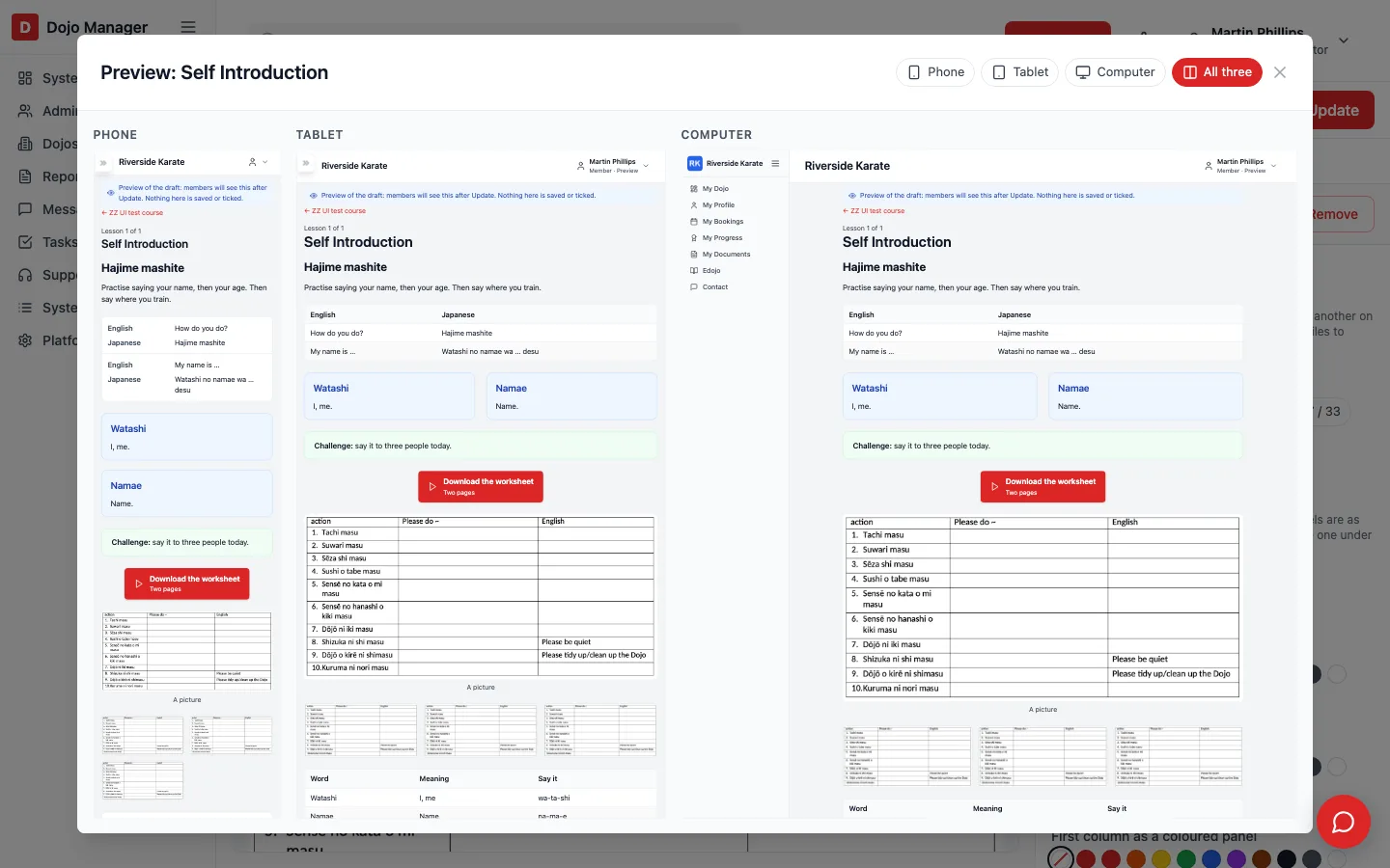
Finally, Preview can show all three sizes side by side, each drawn at its real width and shrunk to fit, so you can check a lesson on a phone, a tablet and a computer at a glance.
What’s next
Our 14 day training challenges open to members on 19 December. The earlier post on online courses for every belt covers how those courses work for members, and who can do what at your dojo explains the permissions behind editing and publishing. If you run a dojo and would like to hear when Dojo Manager is ready, get in touch.